About the project
This project was initiated by Sh. Vijay Kumar Mantri, IAS, Director of NIFT Hyderabad, an institute under the aegis of the Government of India, Ministry of Textiles.
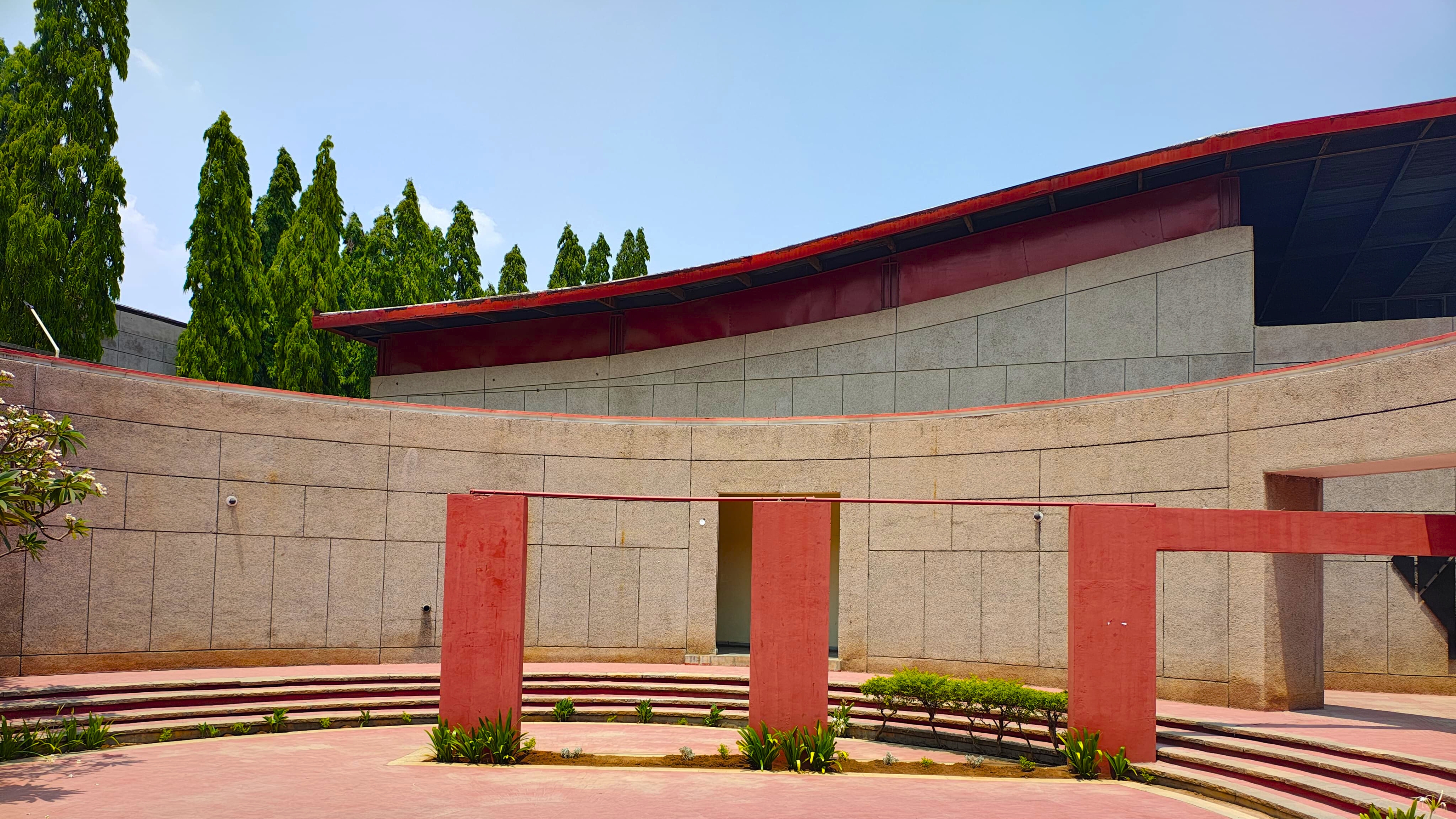
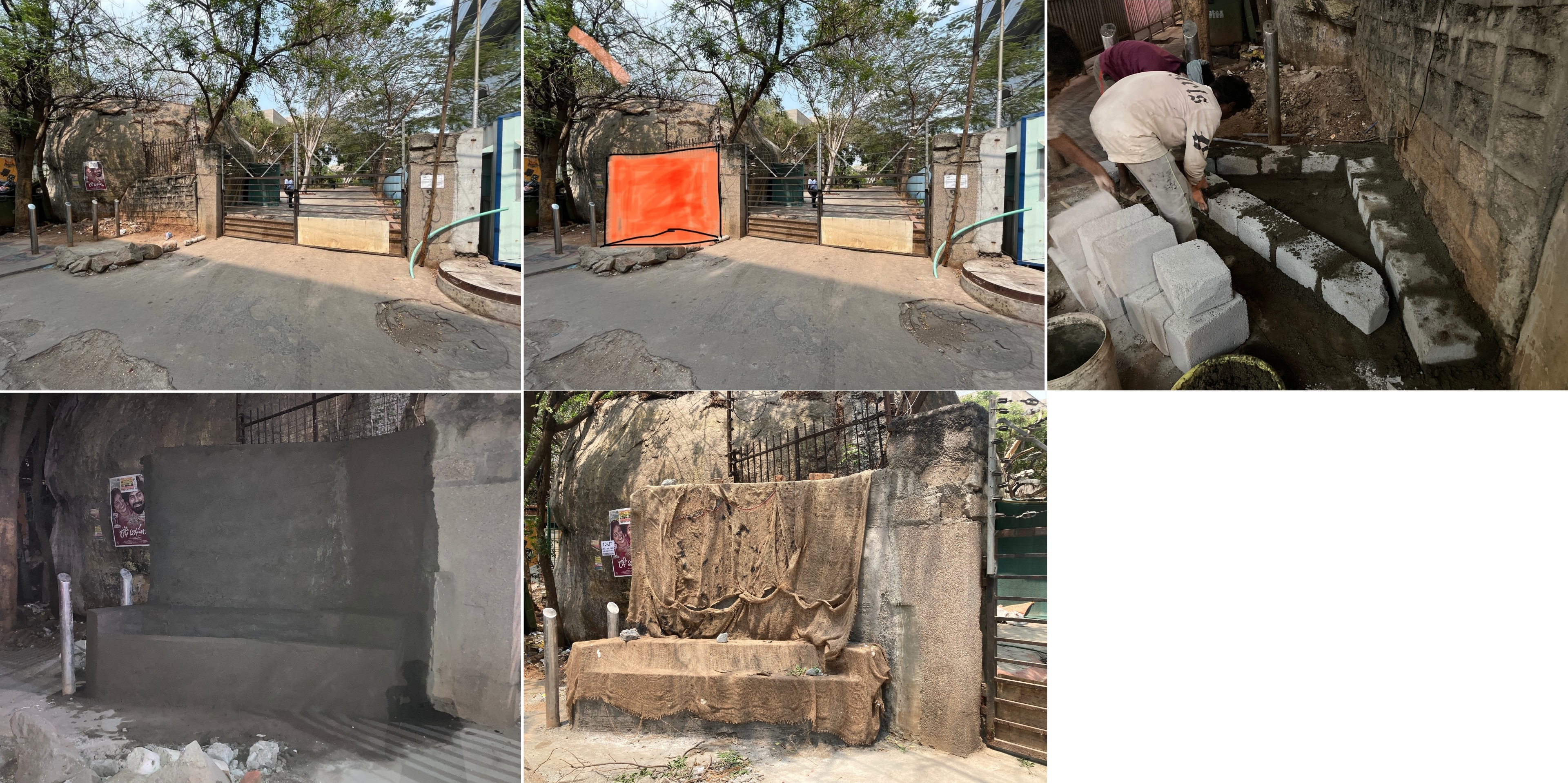
The original site of the project was a neglected corner filled with debris. However, recognizing its importance as the gateway to NIFT, we took on the challenge of transforming it into visually striking and functional architecture. The goal was to refurbish the entrance into a distinguished NIFT gate, symbolizing the institution’s ethos and excellence.
Ideal Ideation
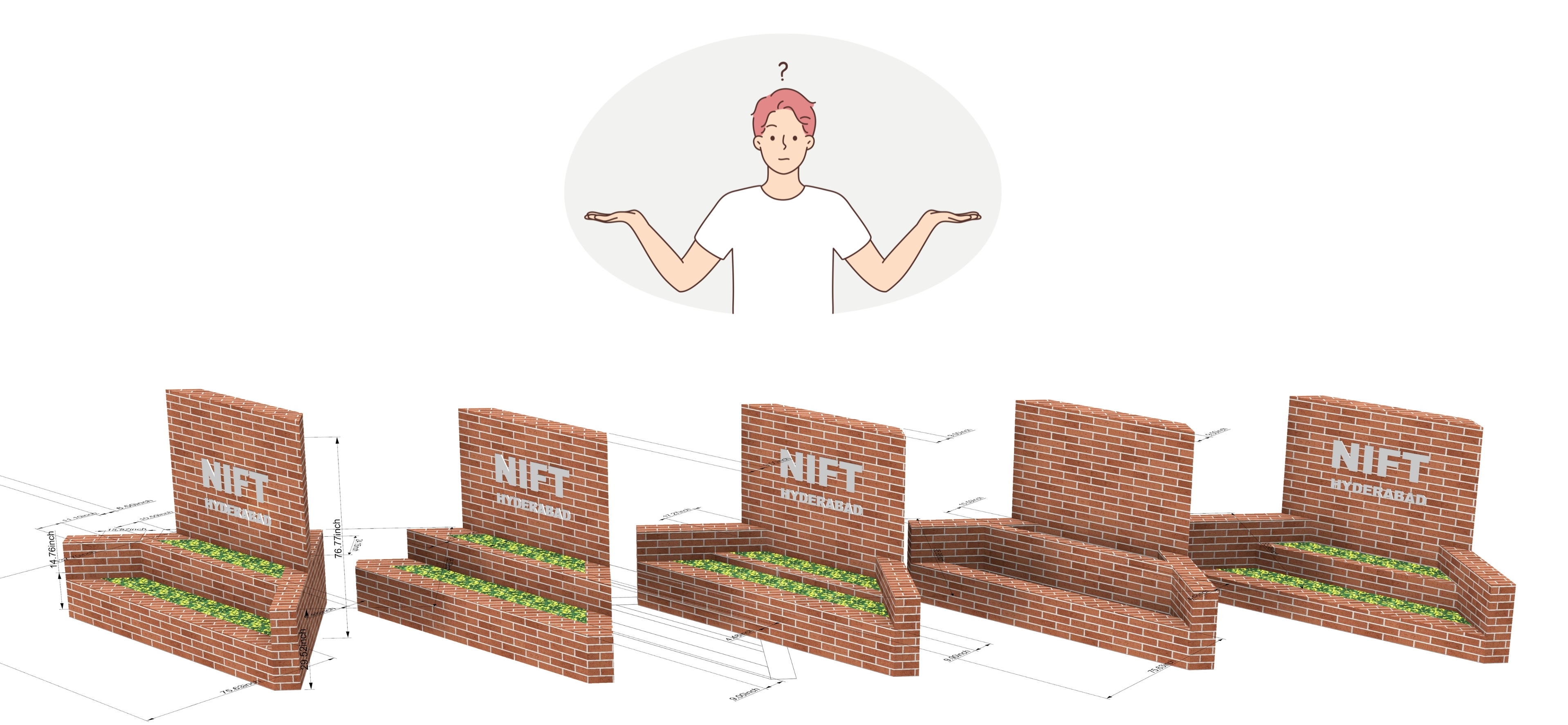
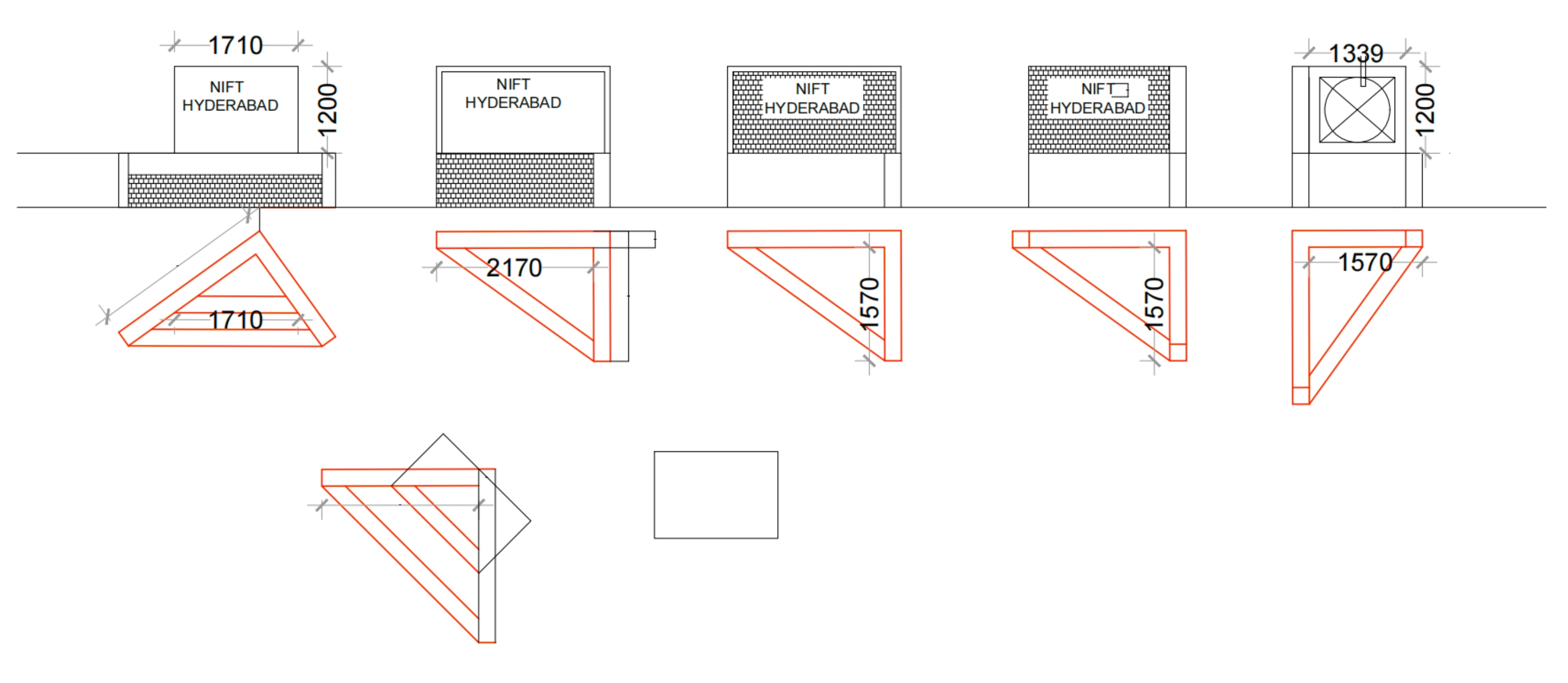
Basic Ideas
We have some ideas for shape of the wall and how it will look like.
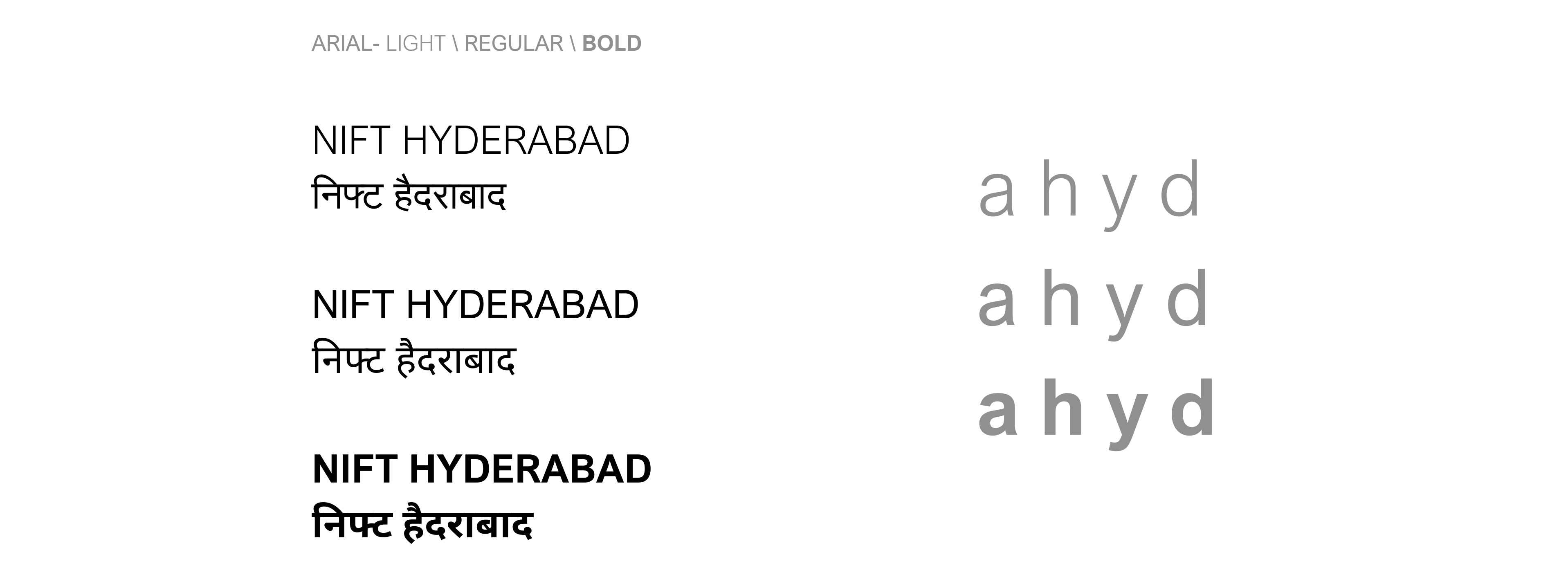
Typography
We chose the Arial font for its clean, modern, and highly legible design. Its simplicity ensures clear visibility from a distance, which is essential for public or outdoor displays. Arial is also a widely recognized and professional-looking font, making it suitable for formal signage like government or institutional projects.
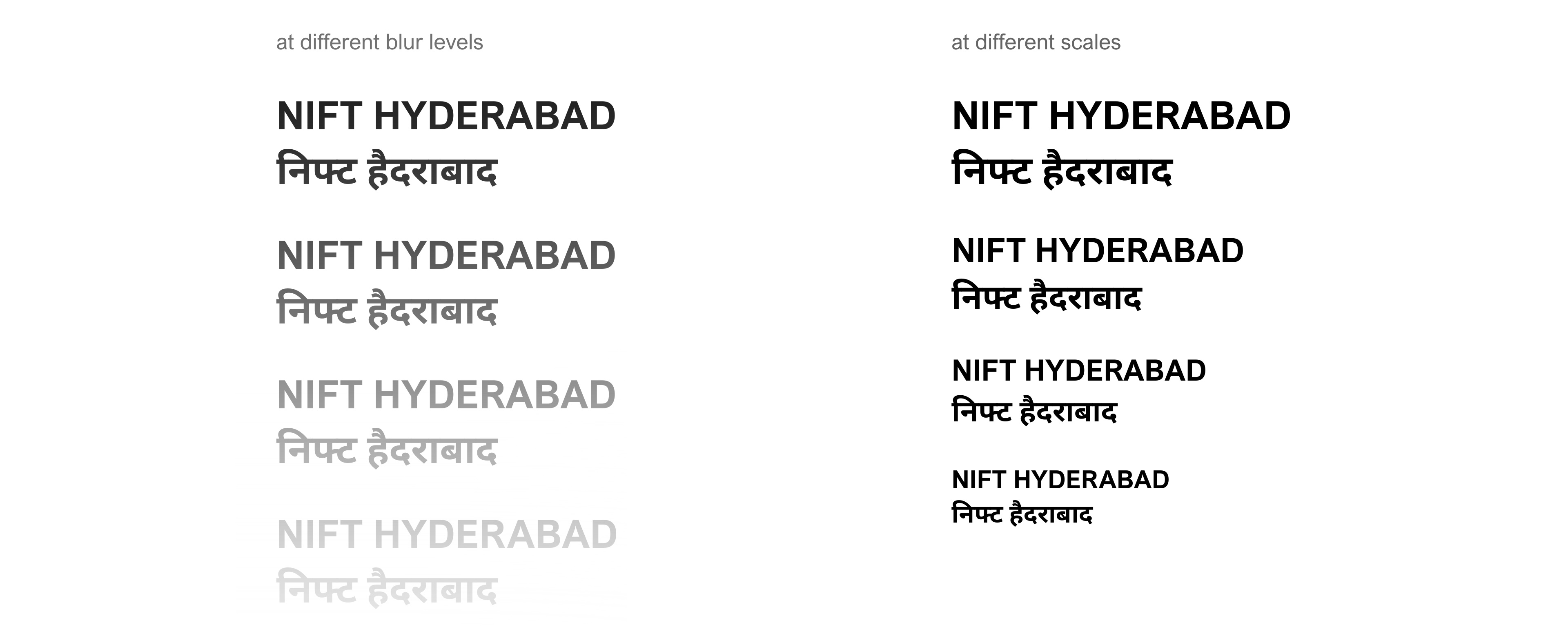
After checking its readability at different sizes and varying levels of blur, these fonts weights were picked.
Text / Font Ideaion
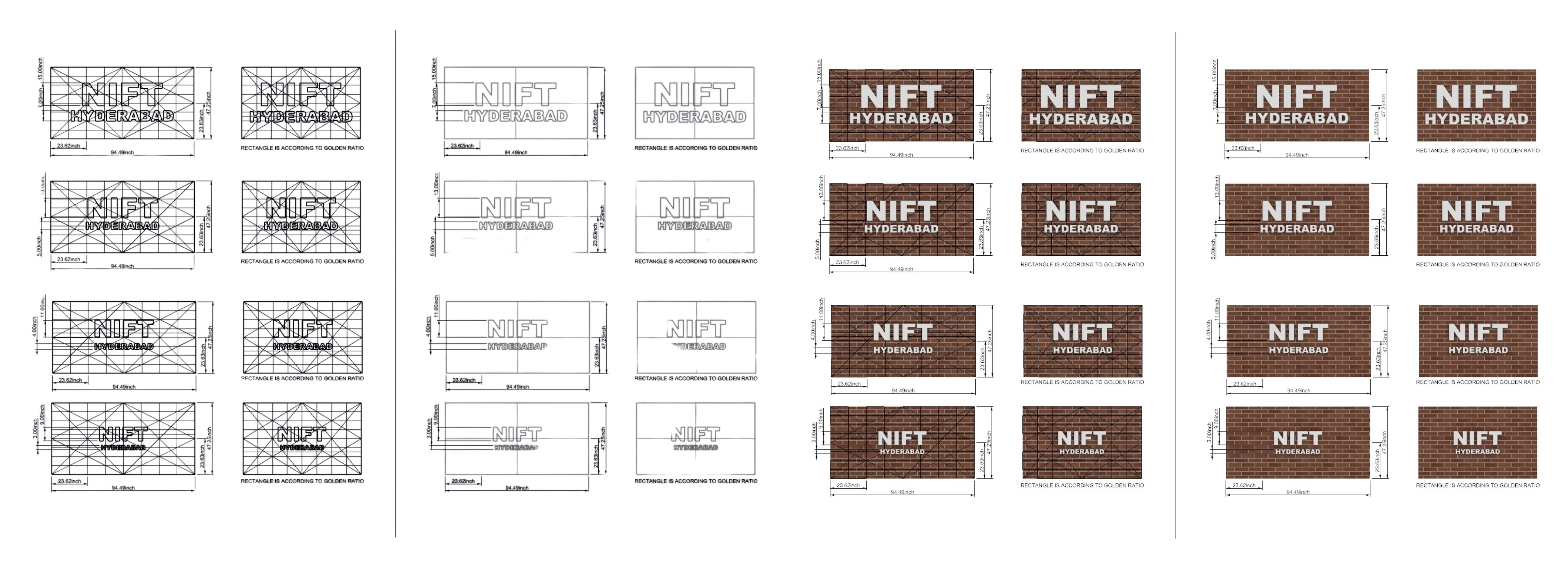
Text Ideation based on space and area of display.
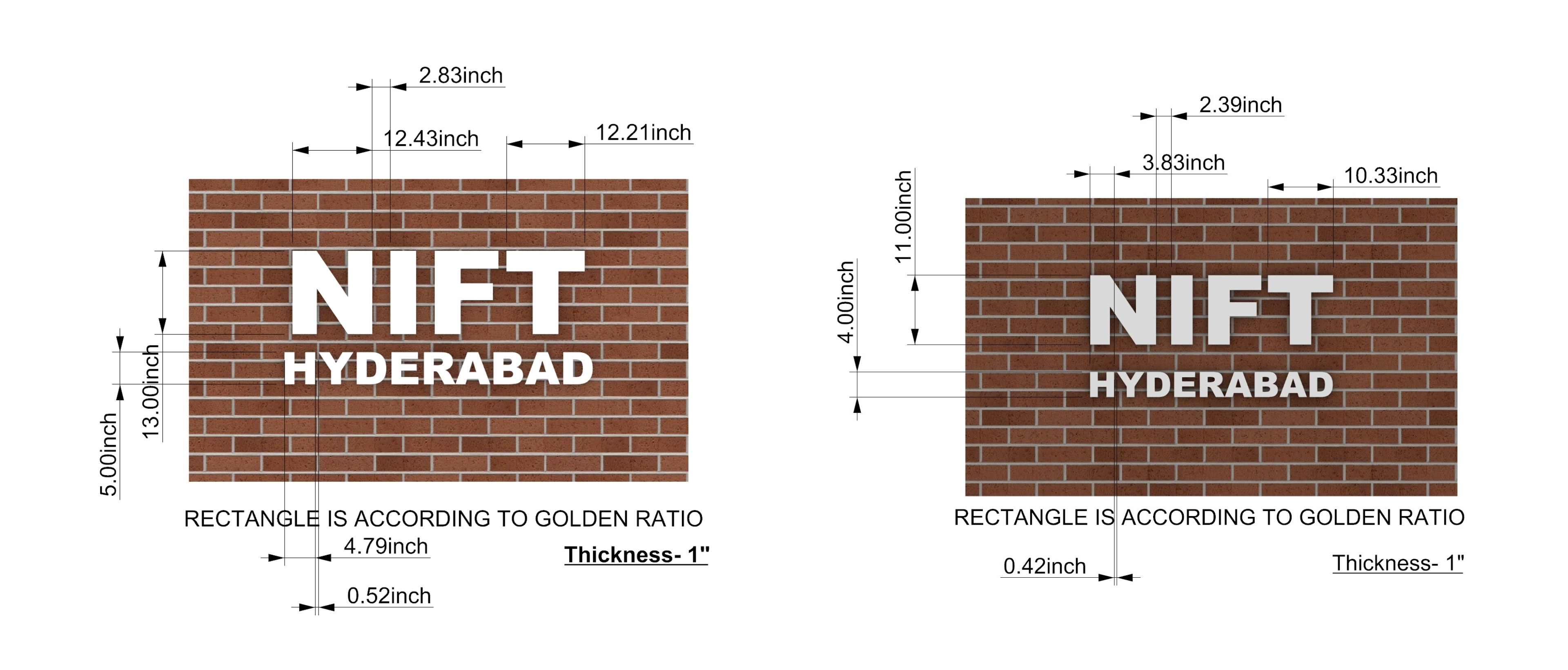
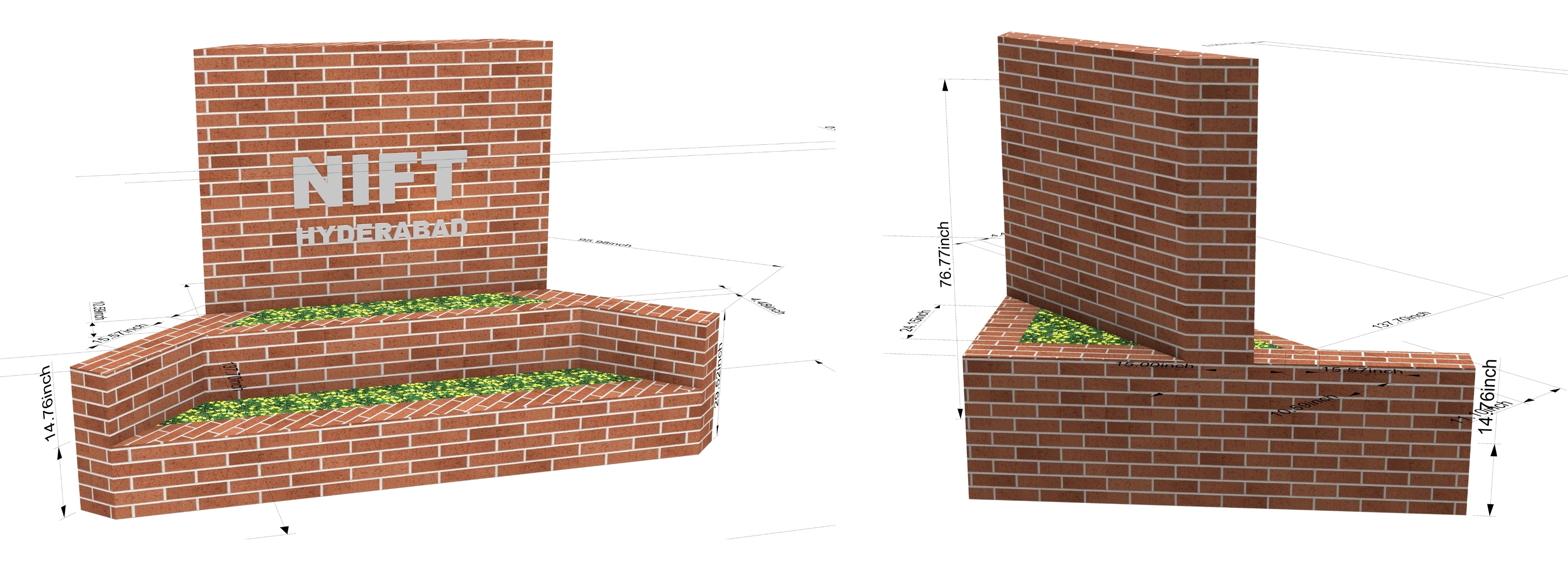
Final Text With Dimension
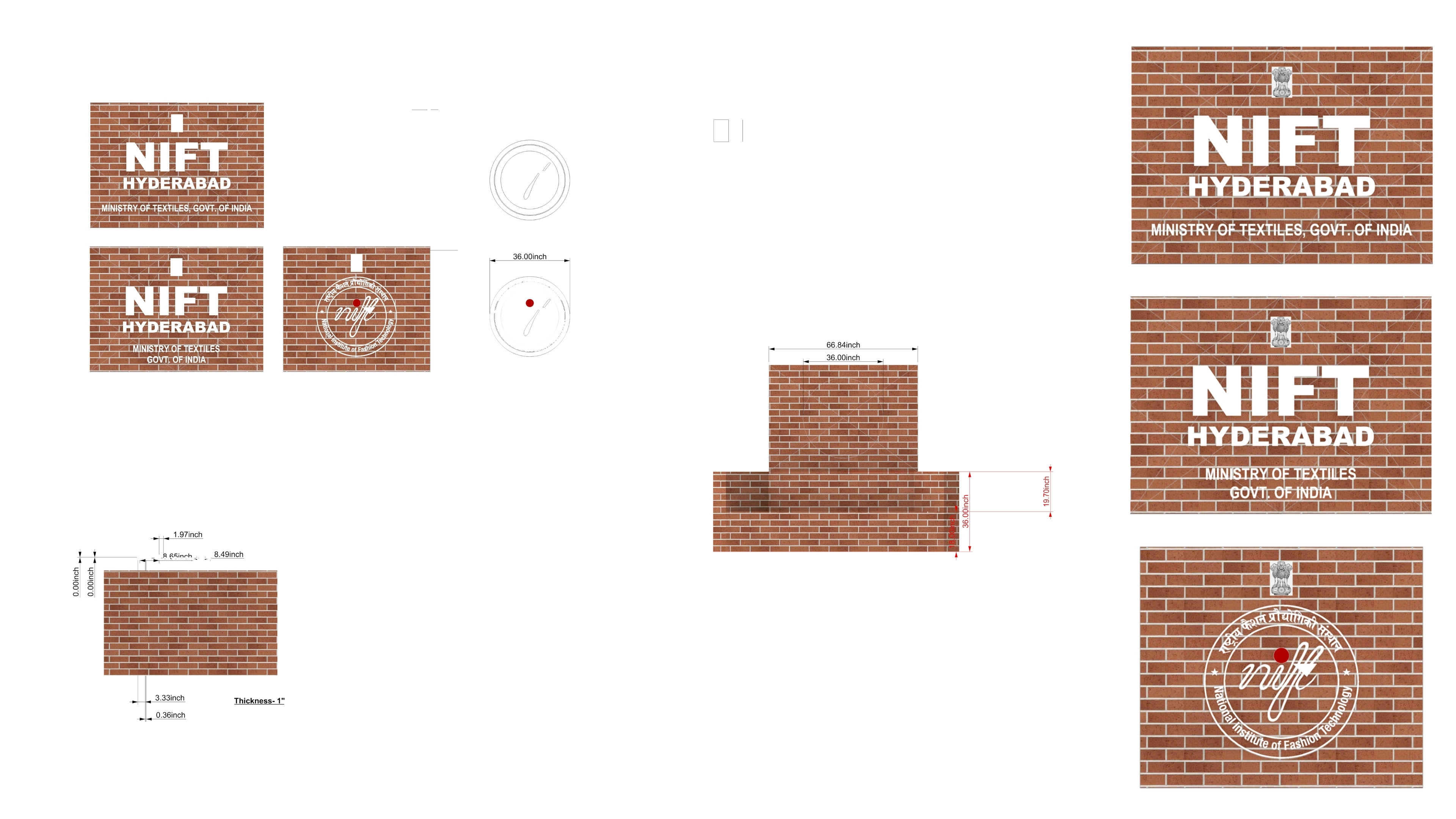
National Emblem Ideation
The final task was to place the National Emblem on the wall along with text or a logo. Since the Emblem had fine details, we decided on a minimum height of 9 inches to ensure clarity and visibility.
Visual Language
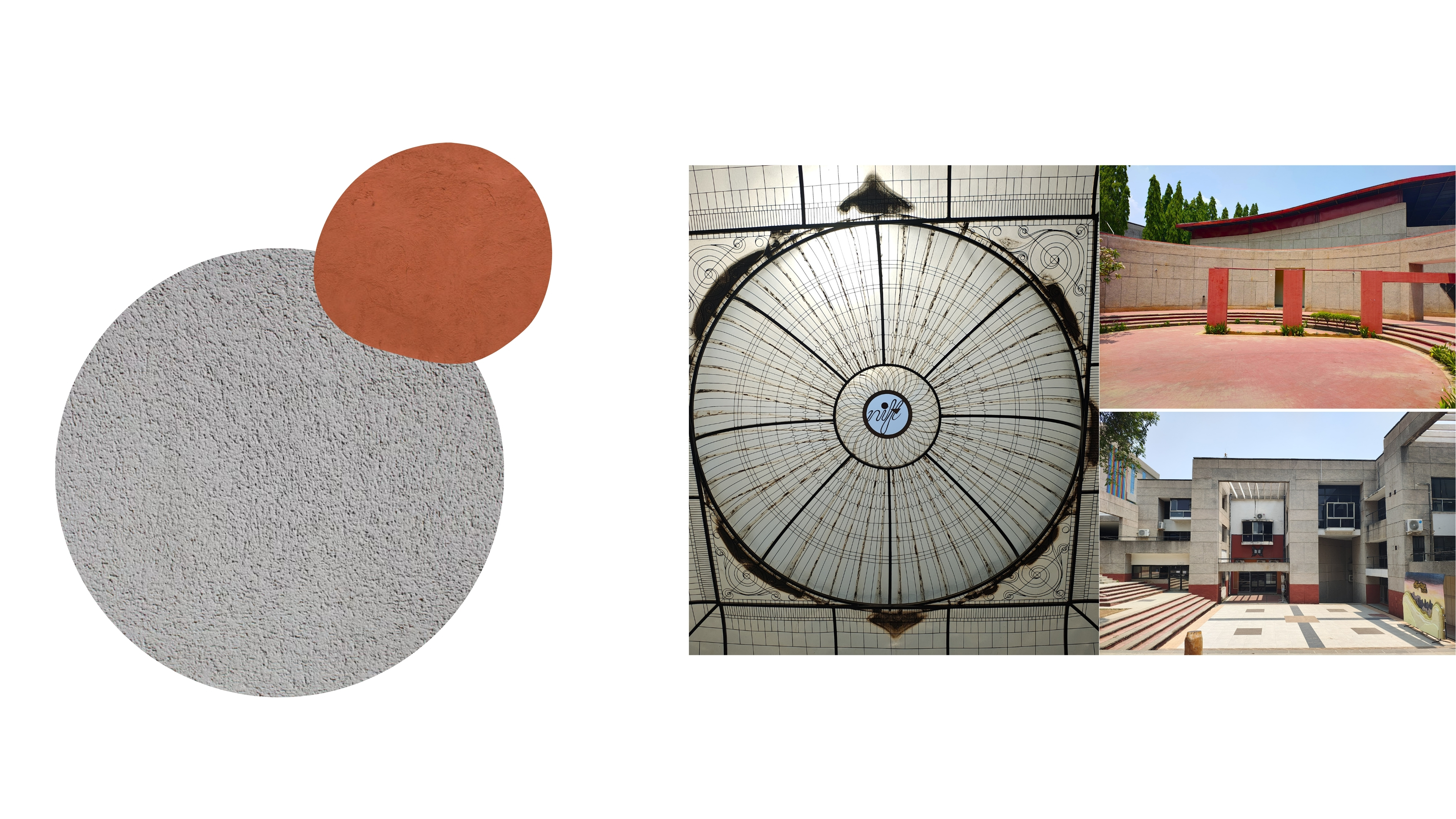
Materials mainly used in the construction of the campus are Natural Stone, concrete and Brick. Rosewood and glass for windows. Chairs have a touch of rope too.
The architecture of the campus mainly have Natural colors and Teracotta pillars, and sometimes ceilings. Shapes are mostly geometrical. Rectangles, squares and circles.
the overall noticable visual element in the campus is the Grit Texture wall and concrete.
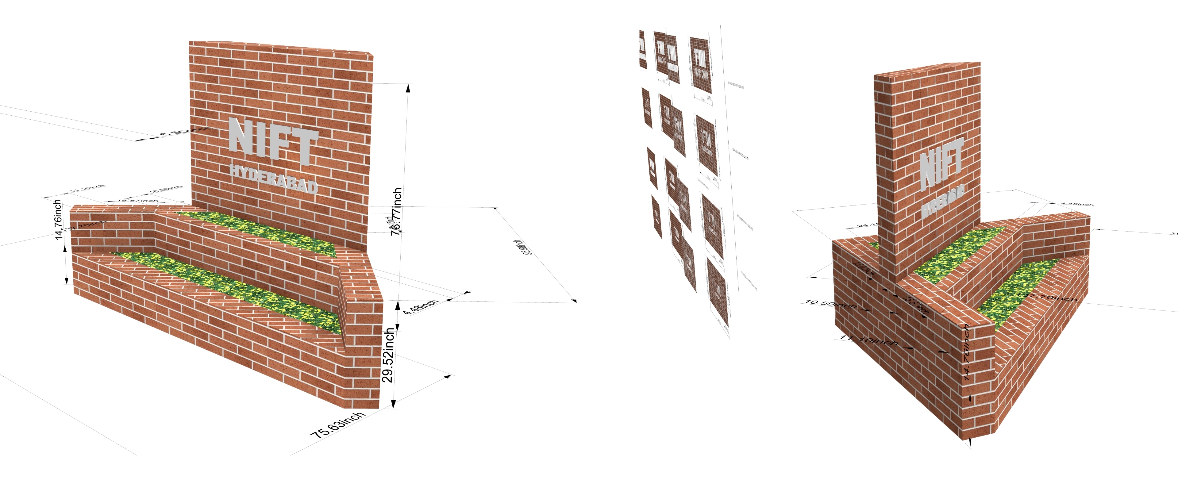
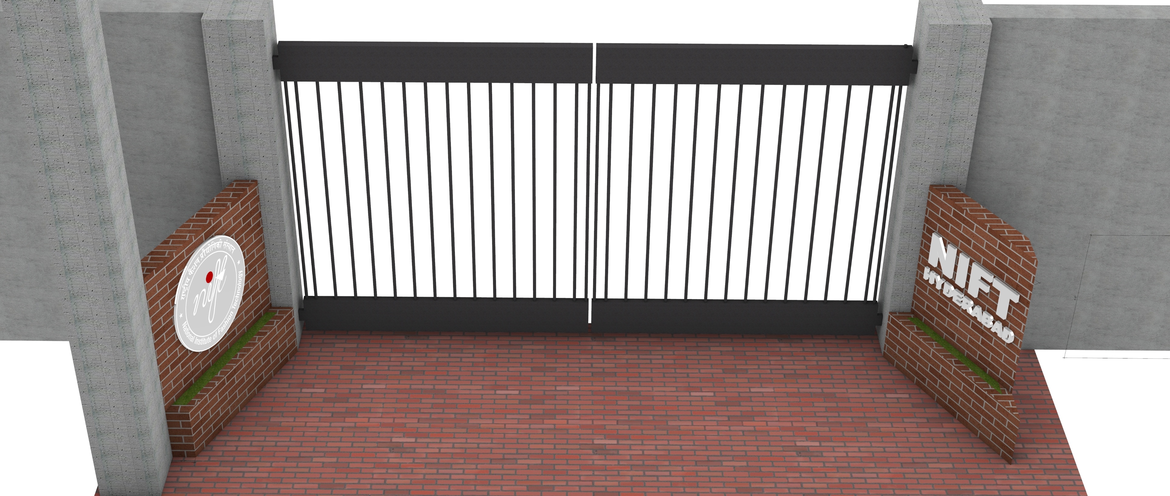
Final Renders
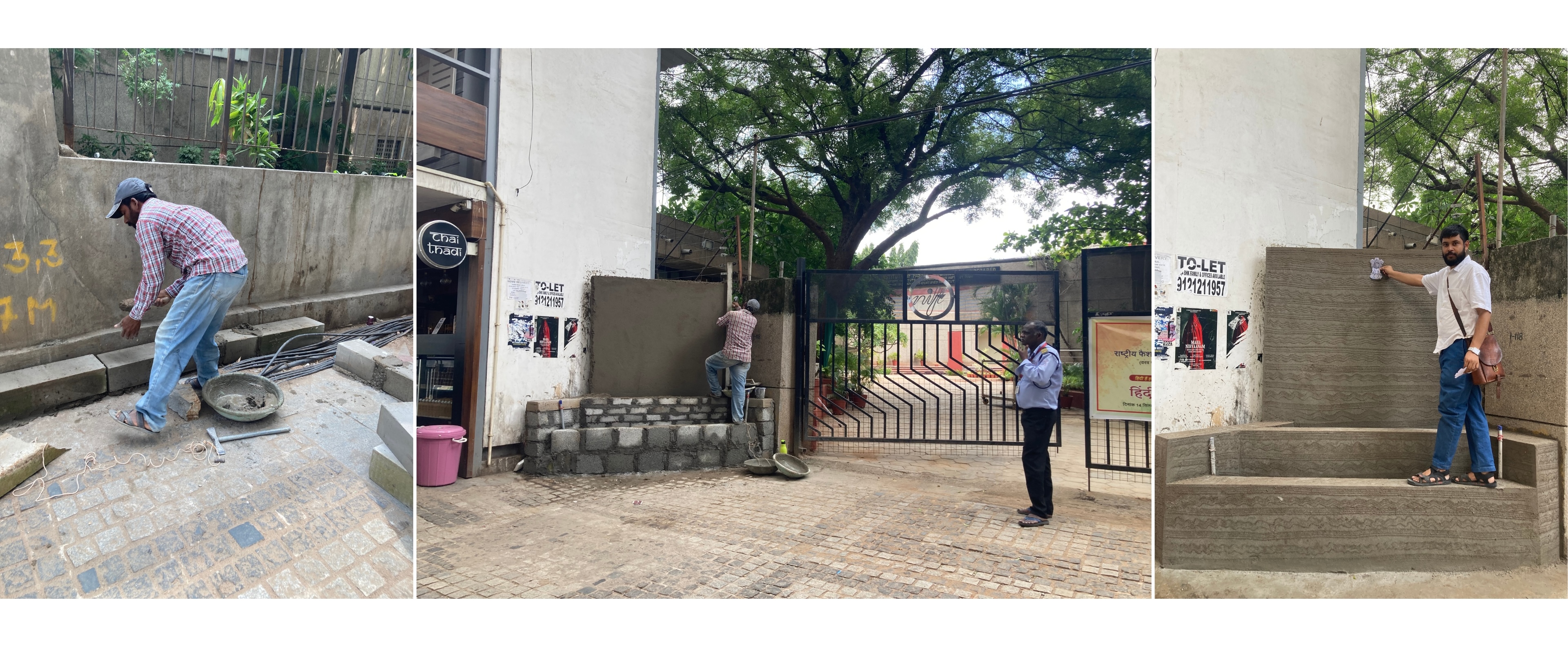
Construction Process
The process of building a wall with bricks and concrete involves determining its height and angle based on the available space, while also ensuring it enhances the overall aesthetics of the area.
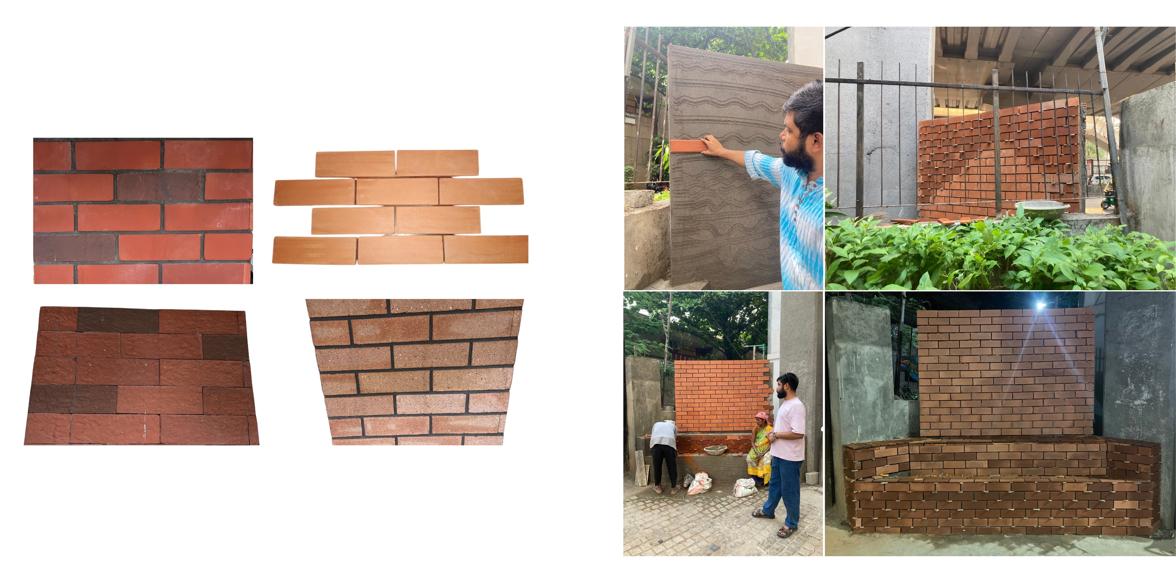
Tile Selection
After completing the wall we decided to use terracotta tile to give a look like stretcher bond brick wall.
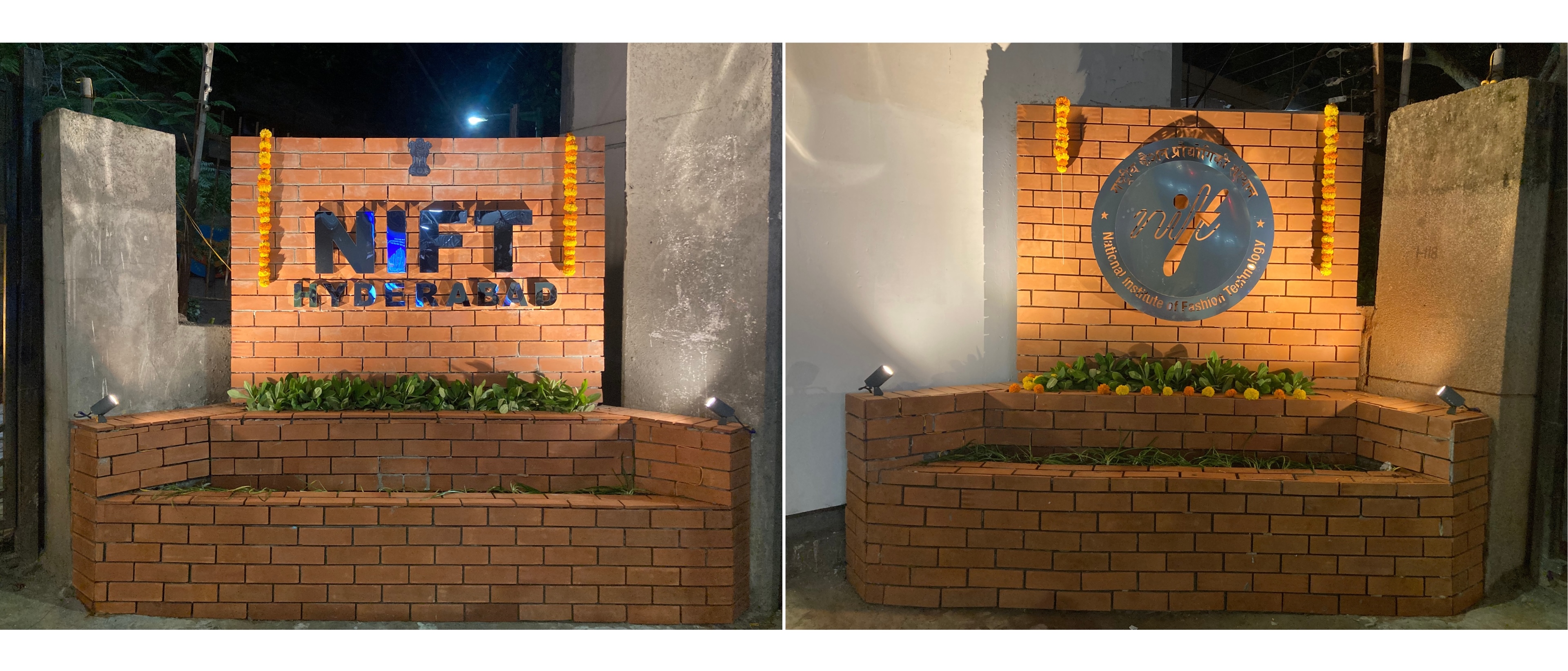
The Final Wall with Teracotta Tiles.
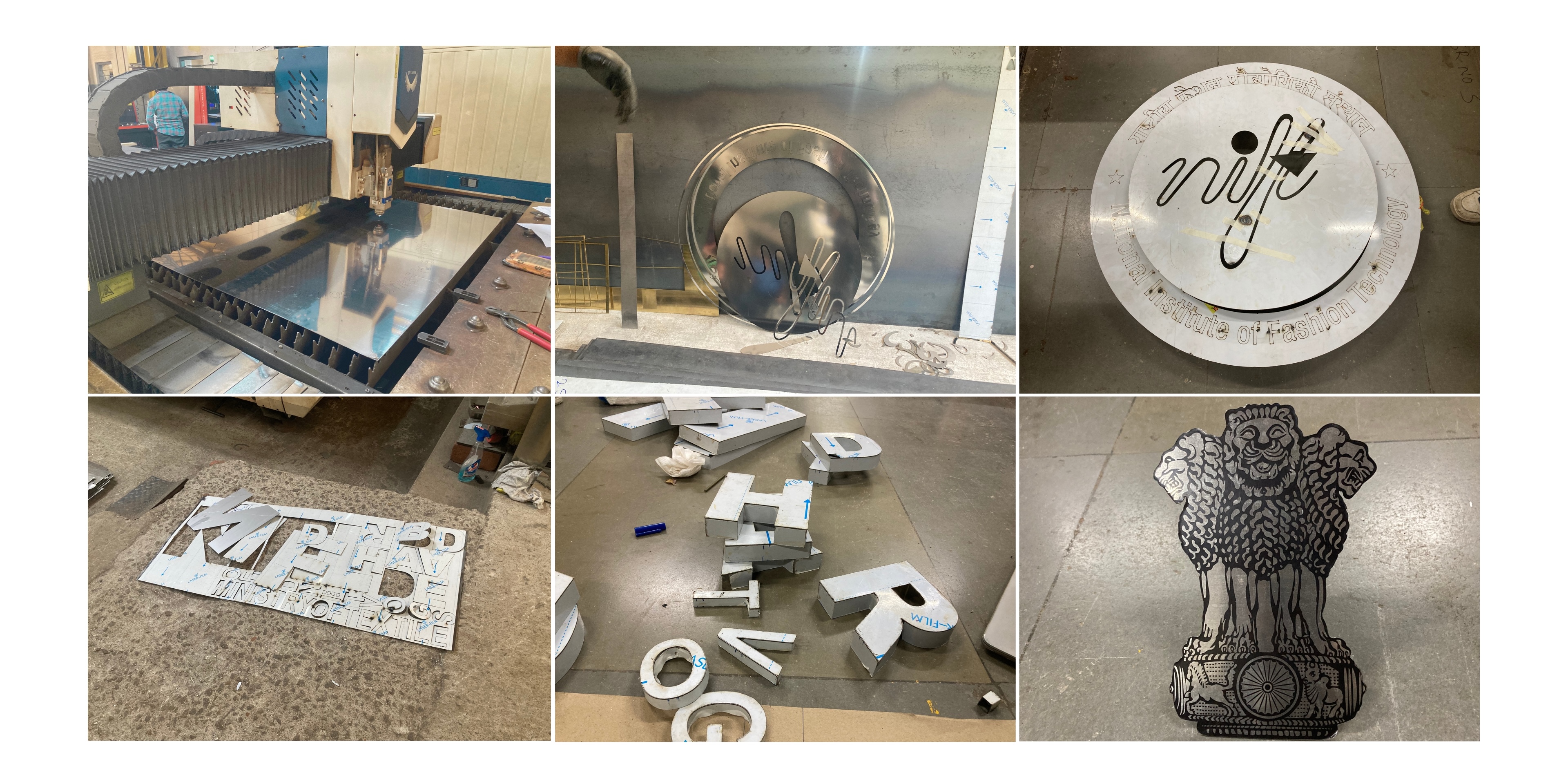
Laser Cutting and Welding Process
Material Selection: Lettering
After thorough research, we decided to fabricate the letters using high-quality stainless steel, as they will be installed in an outdoor area and must withstand various weather conditions.
Staineless Steel Type 302 is an austenitic chromium-nickel stainless steel that is available in the annealed and cold worked conditions.
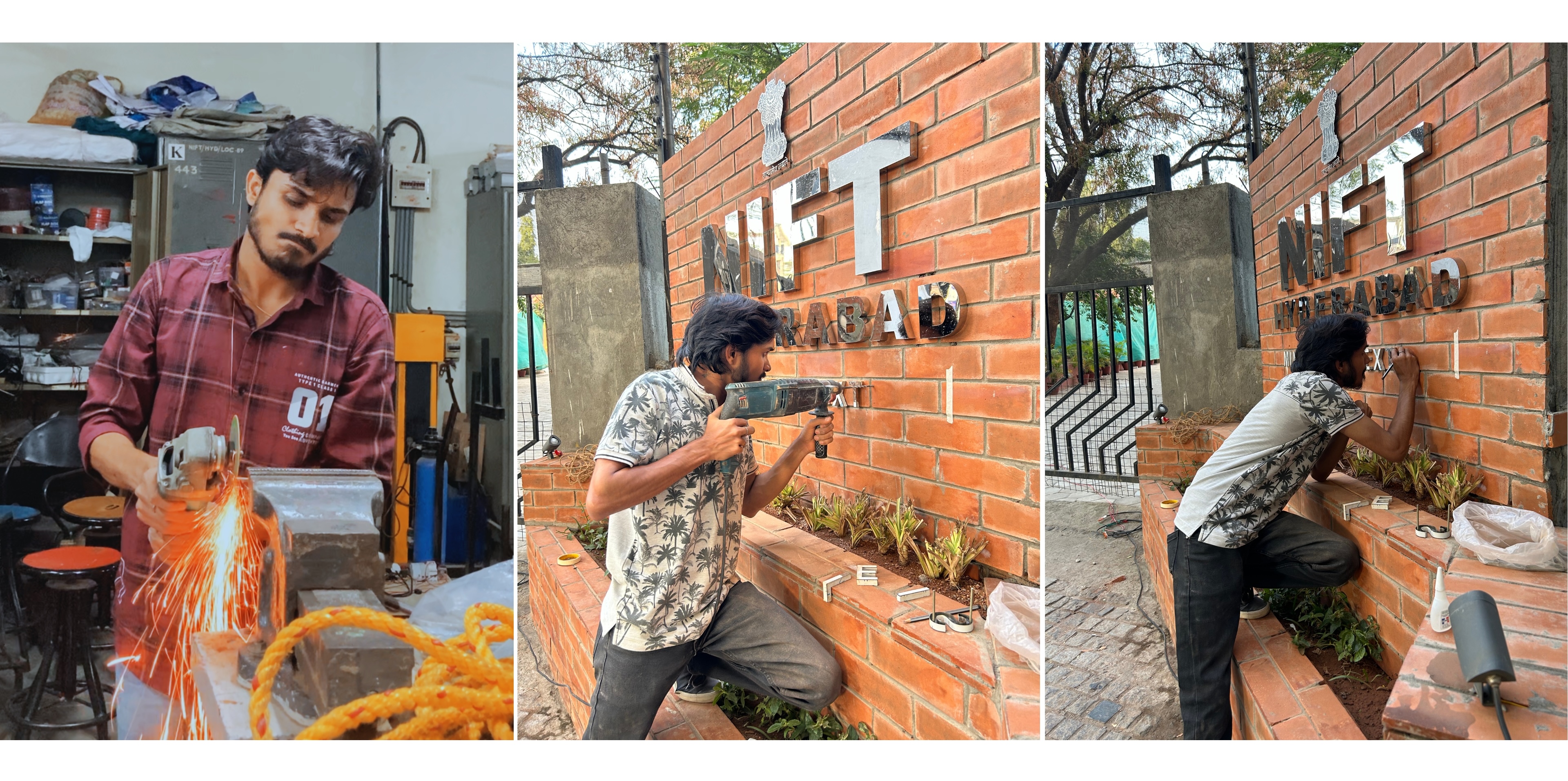
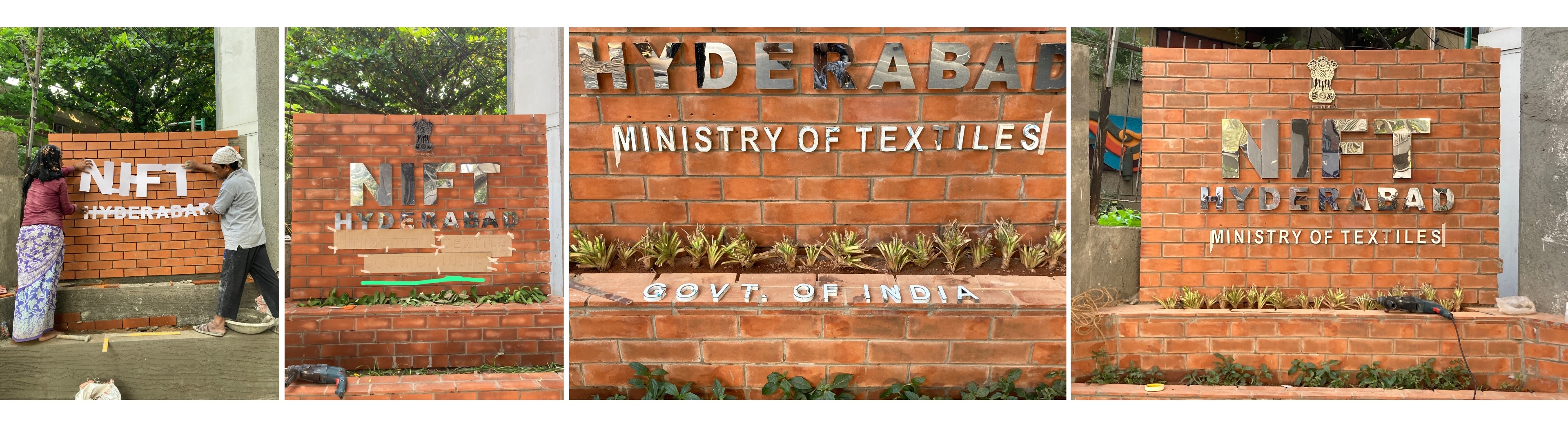
Process of Pasting latters on wall
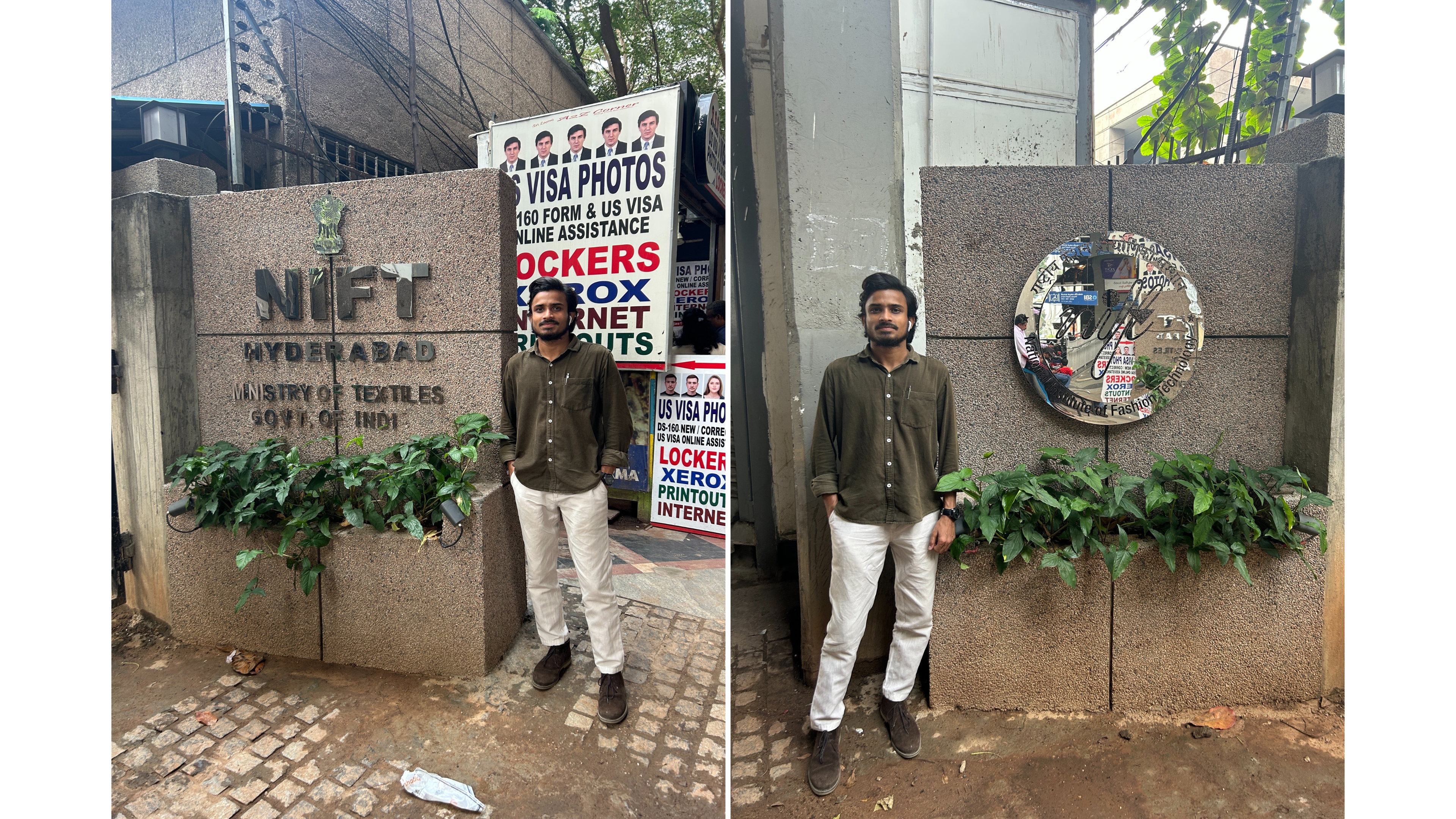
Complete wall with text
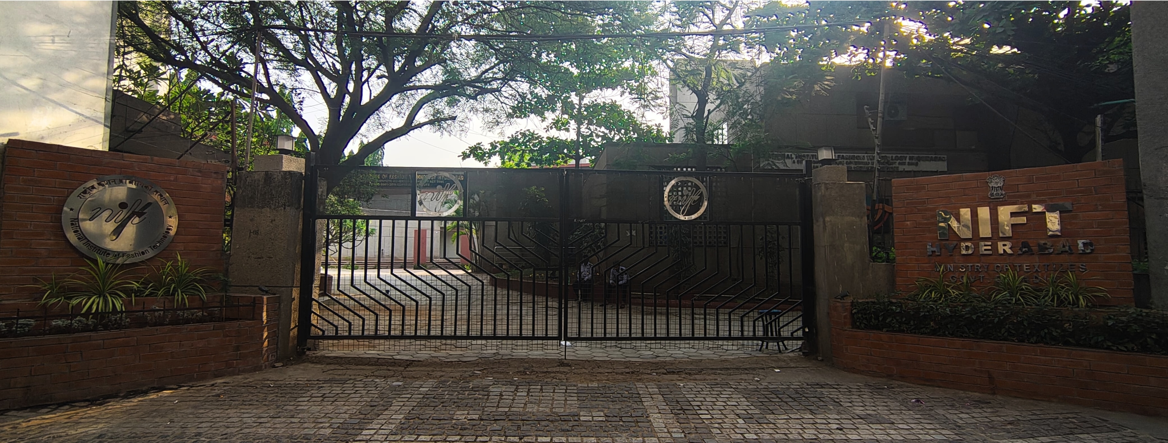
Second Gate
After completing the design and execution of Gate 1, we observed that the adjacent gates—Gate 2 and Gate 3—appeared visually inconsistent and less maintained in comparison. To maintain uniformity and enhance the overall aesthetic, we decided to extend the design work to include Gate 2 and Gate 3 as well.
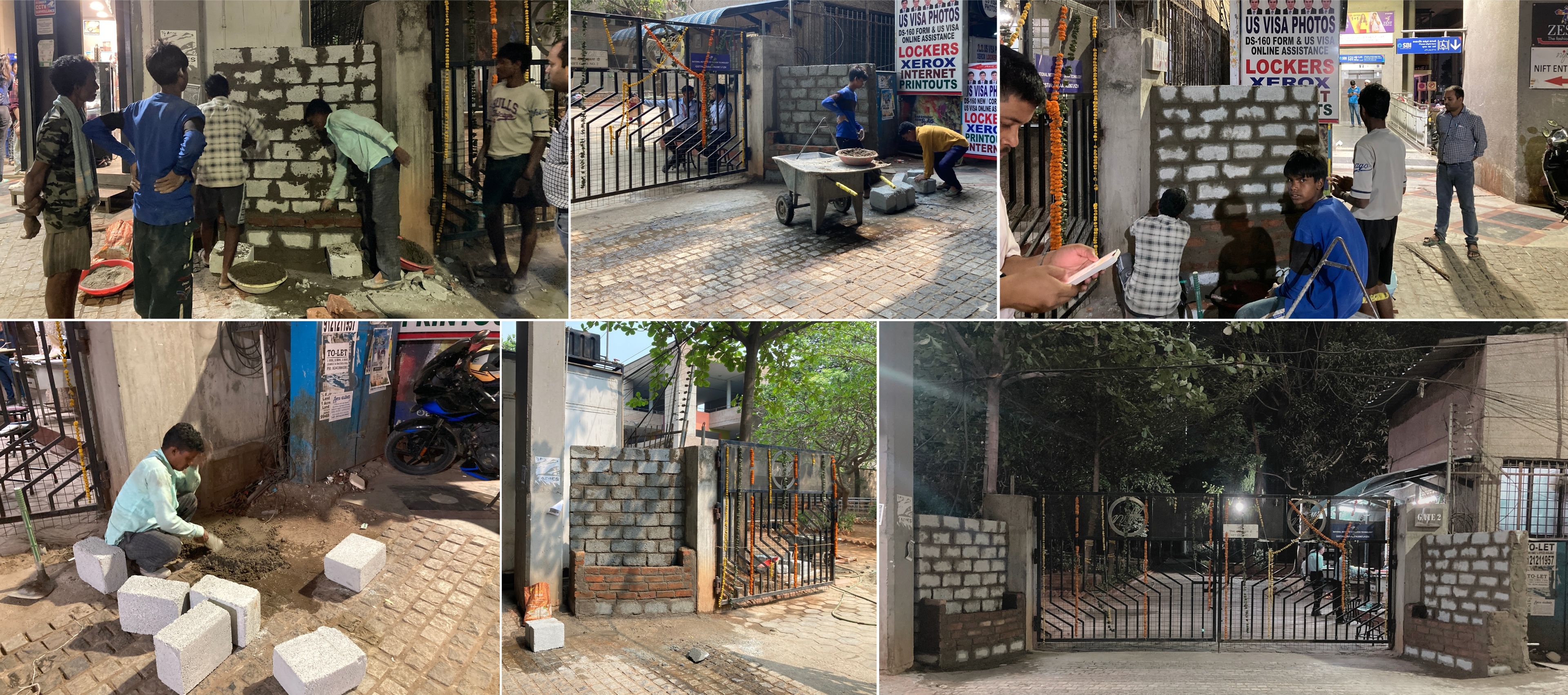
Construction Process
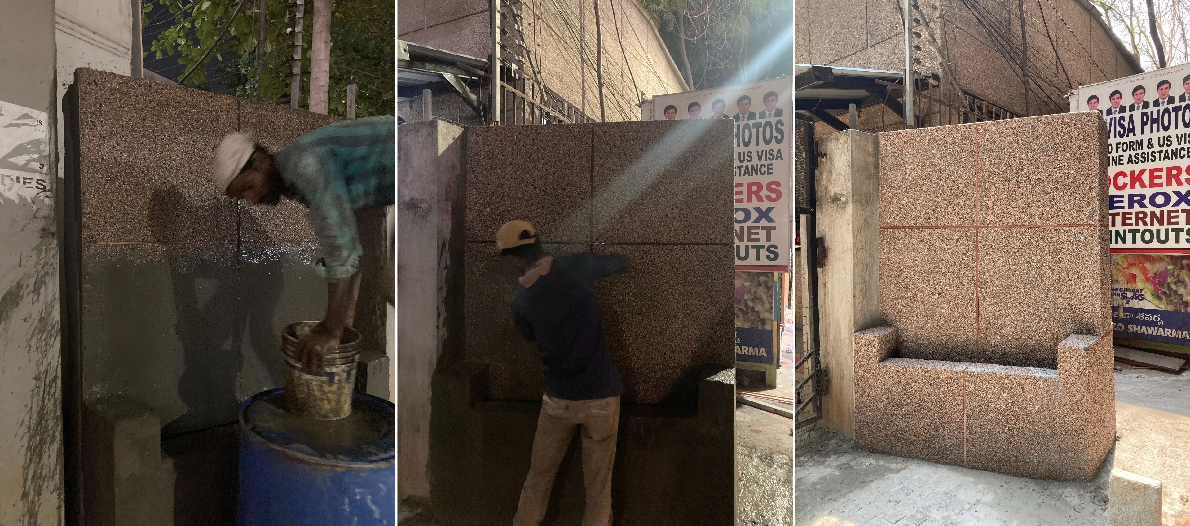
After completing the wall structure, we decided to use GRIT texture as the final finish insead of the initially planned terracotta tiles, as it offered a more suitable aesthetic and durability for the design.
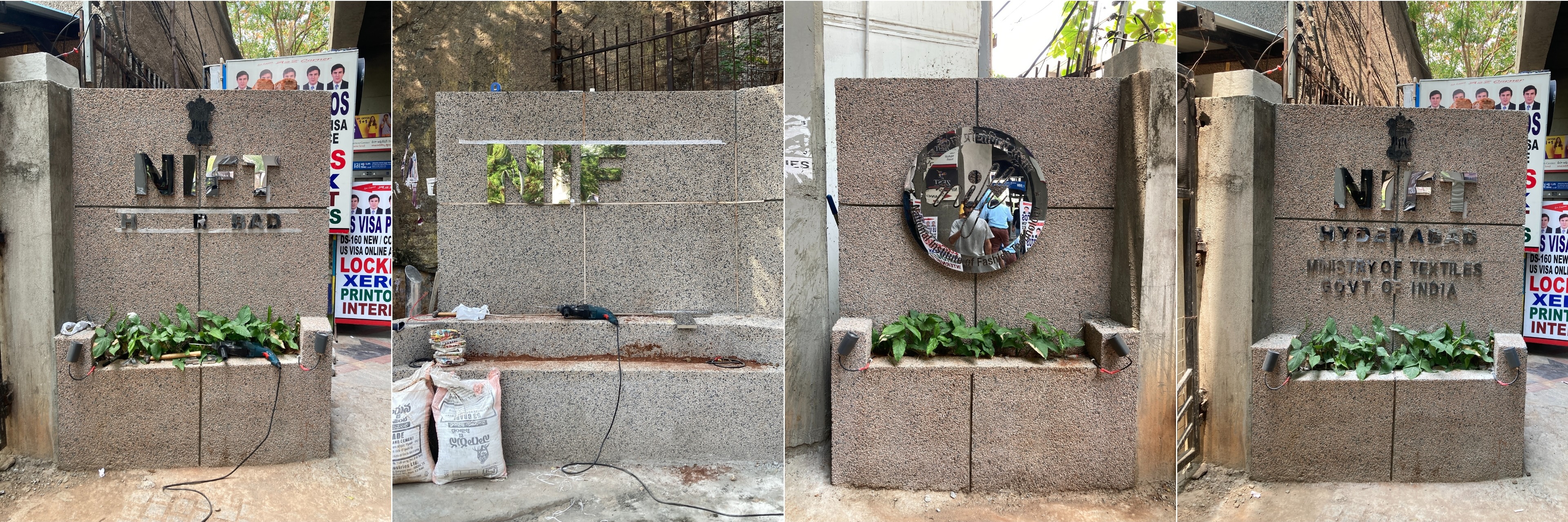
Process of Pasting Letters on wall
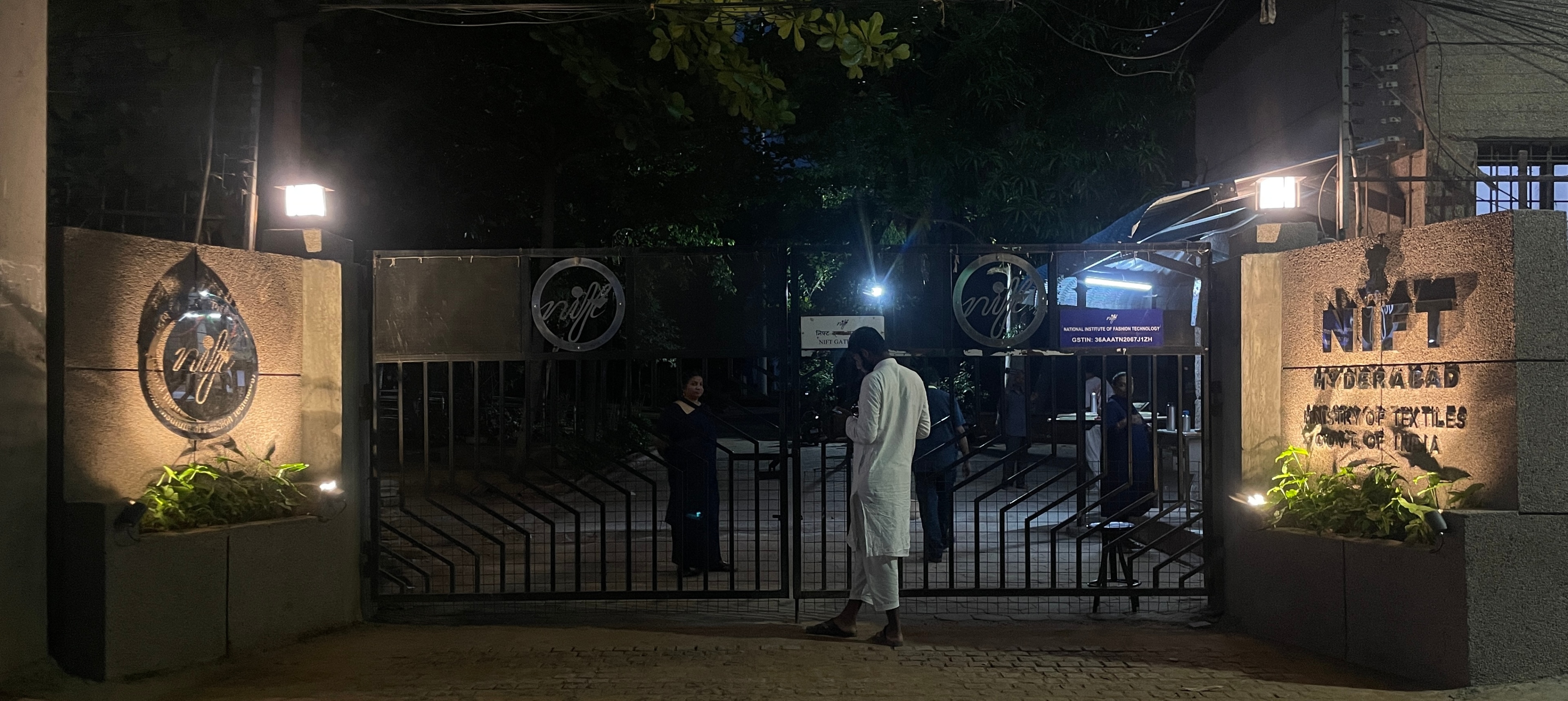
Final Second Gate
Third Gate
After completing the design and execution of Gate 1, we observed that the adjacent gates—Gate 2 and Gate 3—appeared visually inconsistent and less maintained in comparison. To maintain uniformity and enhance the overall aesthetic, we decided to extend the design work to include Gate 3 as well.
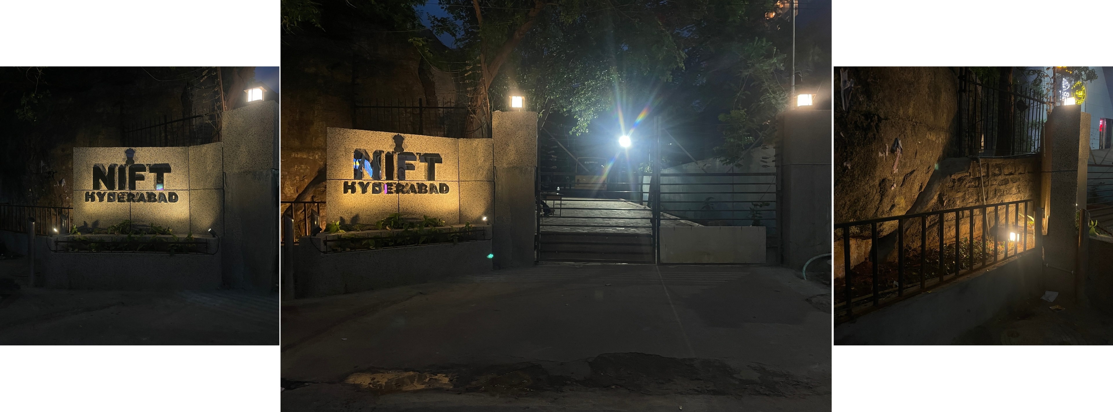
Final Gate
After completing all project stages, it was a valuable experience to work from concept to final execution. The process taught me how to effectively coordinate with craftsmen and workers, and helped me understand the practical challenges of translating digital designs into real, manufacturable products.
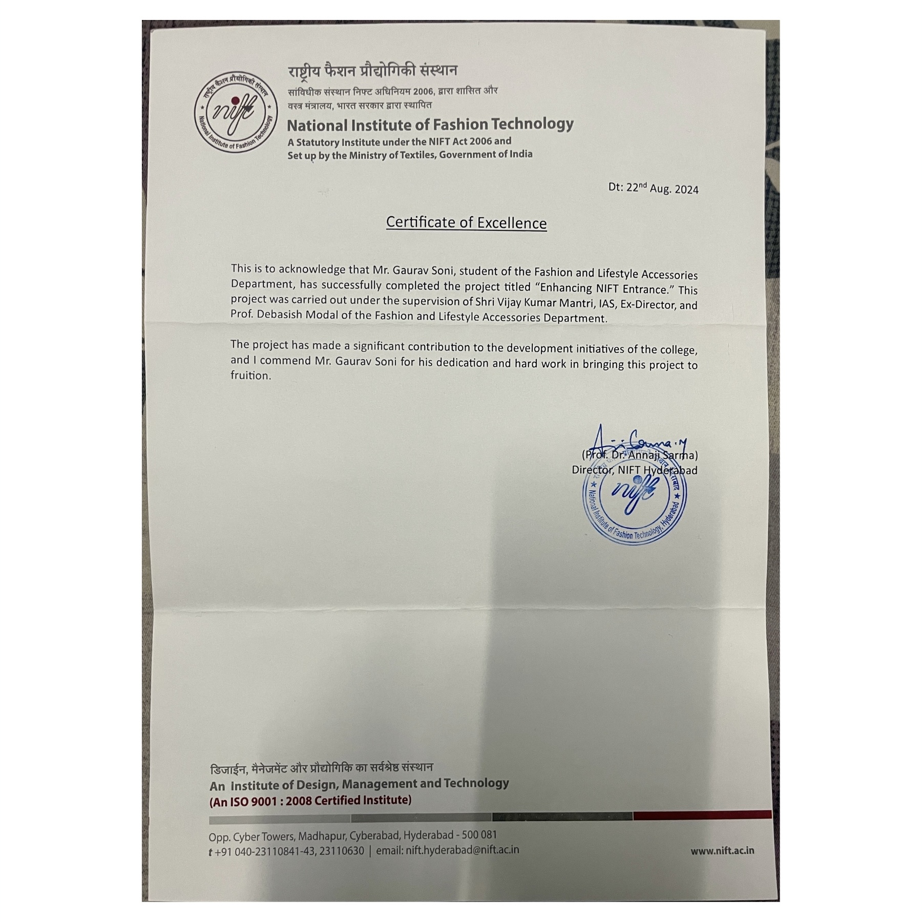
Appreciation Certificate
I got an Appreciation Certificate from our Director of the college.